How to Create Attractive Screenshots for your Apps
Author: Evelin Ríos
The screenshots of a mobile app, along with the description, the icon and the reviews, is an incredibly important factor in convincing a user to download or buy an application.
Quite literally, if the screenshots of your application are bad, or if you do not put the correct ones, people will not download your application, or at least not significant amounts.
The first screenshots that users should see should reflect what your application is about and why it is so good.
Of course, it does not mean that applications with great screenshots will get masses of downloads in the app stores, but it is necessary to do them well if you want this to contribute to the success you want to achieve.
YOUR APPLICATION’S DESIGN
You cannot create good screenshots if your application doesn’t have a good design.
A good design includes a great user experience, simplicity and attention to details, which is obviously something that takes work from the beginning.
For example, suppose that we want to download an app in the “things to do” variety.
The typical search process would be something like this:
- Step 1: We search in the app store and totally ignore any app with 3 or fewer stars.
- Step 2: We visually eliminate those with ugly icons, assuming that the application must be ugly.
- Step 3: We access applications with similar prices and review which seems to be better.
Did you get that? Which seems to be better.
People don’t decide to download an app by reading its description or reviews.
They look at the screenshots.
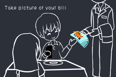
HOW PEOPLE DECIDE TO DOWNLOAD AN APPLICATION
In the next image, we see how people classify applications to purchase or download.
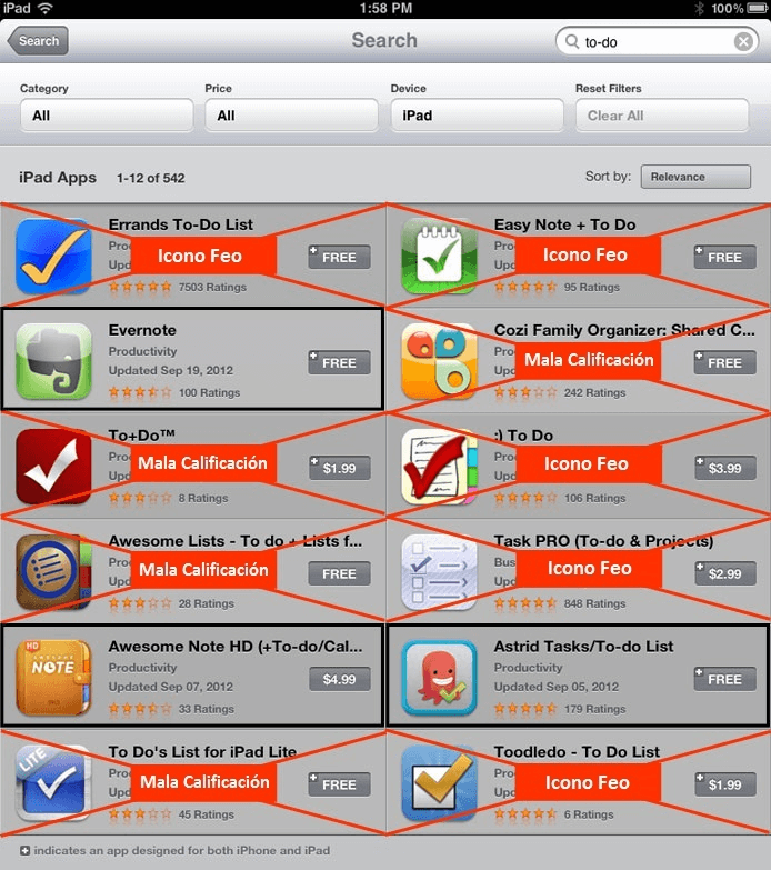
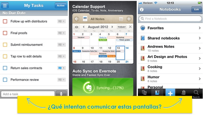
Only 3 out of the 12 applications pass this cycle of selection. Then begins the comparison of screenshots. What are these screenshots trying to communicate?
Tell your potential customers what they are looking at .
An application with a fantastic interface will definitely increase downloads. However, if you only post simple screenshots without a description of features and benefits, you are missing a great opportunity to further increase downloads.
EXAPLES OF EXCELLENT SCREENSHOTS
Next we will analyse some examples of apps in Google Play and the App Store which have done a great job with their screenshots.
SpaceEffect PRO – (Available in the App Store)
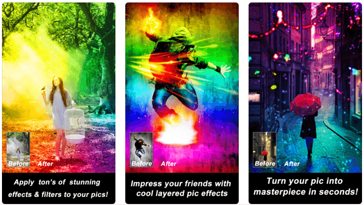
What makes these screenshots stand out is that they provide very clear images of the exact functionality of the application. Go from “this” to “this”.
Writing brief but concise explanations in your screenshots is very important to convince users to download your application.
Pawprint – Pet Health Tracker- (Available in the App Store and on Google Play)
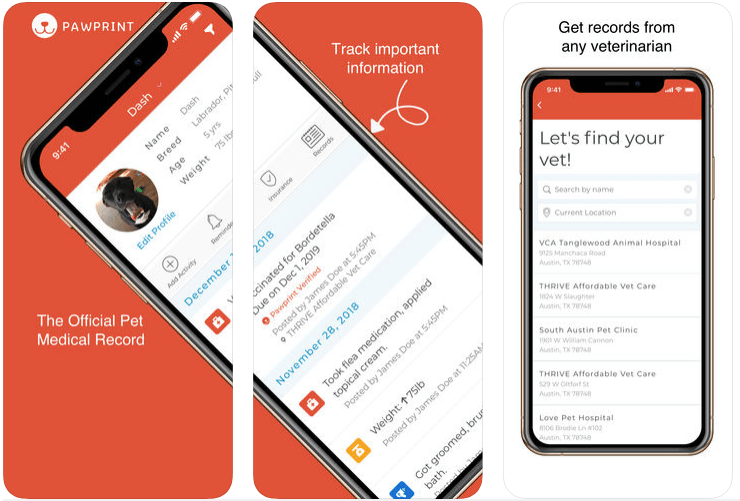
Here we can appreciate a technique that has become increasingly popular (Eye Catching), where the screenshots are obtained from a panoramic image.
This technique is really useful when it is not possible to completely communicate an idea in just one screenshot.
Chamelon Clock – (Available in the App Store)
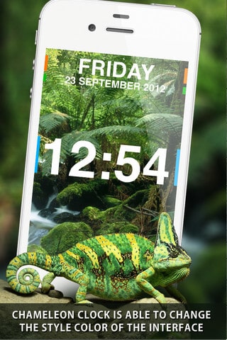
This screenshot says exactly what the application does and shows an image of doing just this.
Make note of this type of clarity. People who are confused do not buy.
Contact Paranormal – (Available in the App Store)
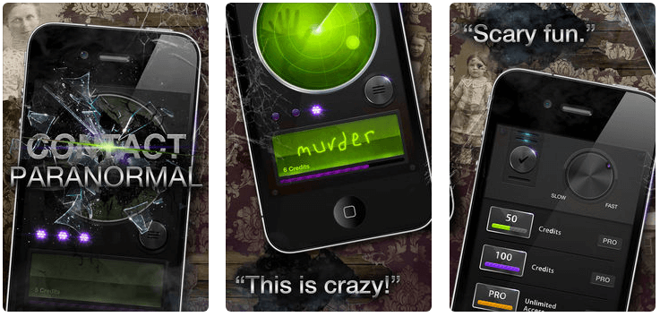
Here we can appreciate some interesting elements.
The spooky background image stirs the emotions. It makes you curious to look at the app.
The same happens with the broken glass in the first image and the spider’s web with the word “murder” in the interface of the application shown in the second image.
Also showing users opinions “This is crazy!” and “Scary fun” is very good. All of this works.
QuickMark – (Available on the App Store)
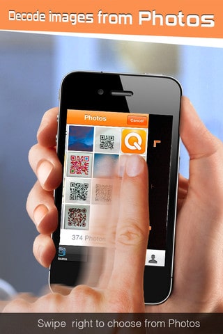
Although this is not a great example because it is not clear what is intended by the above text, something that is very good and should be taken into account is the blurry finger, which is another way of visually explaining how the application works, showing motion.
Clear – (Available in the App Store)
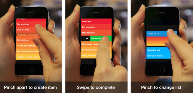
Another good example where a real environment can be appreciated, with hands manipulating the interface and explaining how the application works.
EXAMPLES OF POOR SCREENSHOTS
Next we show the opposite side, what you must not do as you create the screenshots for your application.
These screenshots were obtained some time ago and it is possible that some applications have corrected the errors that we will be showing, but the idea is to refer to them in order to have a basic idea of what should be avoided when creating screenshots for applications.
Simple Photo Note – (Available in the App Store)
This application uses cartoons to describe the functionality of the app, but doesn’t show images which demonstrate its interface.
You must always make sure you include images of the application interface.
Task – (Available in the App Store)
This would be a fantastic photograph, if it weren’t for the long fingernails! Make sure that any photos of hands or fingers show they are well looked after.
Craigslist– (Available in the App Store)
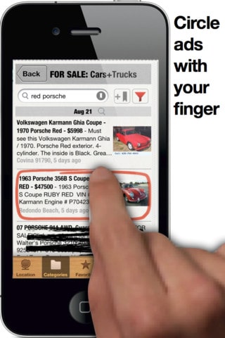
The hand in this image has two problems:
- It is in very low resolution and appears pixelated
- It has not been cropped correctly and has a blank space on the left hand side of the index finger.
If you are using a hand or pointing finger, make sure that the image is carefully cropped in Photoshop.
Calendar iBirthday– (Available in the App Store)
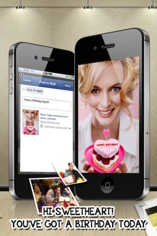
This screenshot tries to illustrate that you can send greetings to a loved one through Facebook. Instead of displaying the text “Hi Sweetheart” at the bottom, it would be better if you simply described the actual functionality of the application.
Also, if you ever need to put a white outline around text in order to see it clearly, it is because you are trying to put the text in the wrong place.
In this example you could put text on the phones and not need the white outline.
Calendar Importer – (Available in the App Store)

Avoid the use of screenshots that look like fake photographs. For this example, it would be more impressive to show a screenshot of the application that shows how it will help to remember the rental of spaces for important events.
Gossip Junkie – (Available in the App Store)
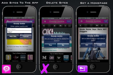
Too many screens are shown in this image. When we view it on the iPhone, iPad or internet browser, it is difficult to see what they are trying to illustrate.
NoteDown– (Available in the App Store)
This example has so many speech bubbles with descriptions that they almost cover the entire interface of the app.
FINAL RECOMMENDATIONS
Some developers do not upload all the screenshots that Google and Apple allow, and of course, that’s a mistake. Use as many as you can!
If your application is available in several languages, use screenshots for each of them. Of course it takes more work, but it’s worth it if you’re determined to promote your application in other countries and languages, increase your visibility and thereby the number of users who may download it. If you want to learn how to internationalize your App, be sure to read this article.
We hope you have found these tips useful, and remember that factors like these are crucial to the success of an App.